
 Locations
Written by Shumin Liu, Data and Impact Management Consultant, UNDP Bangkok Regional Hub; with Francis Capistrano, Head of Experimentation, UNDP Accelerator Lab Philippines; and Jonathan Hodder, Governance Analyst, UNDP Philippines
Since the onset of the COVID-19 pandemic, most of us have developed a new habit: checking disease monitoring dashboards every day. While the statistics on viral infection rates, deaths, and recoveries grab the headlines, there are other critical data points that exist right under our noses which could help us better understand the spread and impact of COVID-19. For example, data from telecommunications companies may help us understand the relationship between mobility, population density, and viral infection rates; while pharmaceutical sales can indicate possible spikes in infection rates before the official results come in - a particularly useful strategy in areas wherein testing is not extensive.
There is so much data out there. We only have to open our eyes to it.
It is for this reason that UNDP Philippines launched the Pintig Lab, a multi-stakeholder network of data scientists, epidemiologists, economists, and other field experts that synthesize data from the public and private sector into policy recommendations that can inform the government's response and recovery strategy against COVID-19.
Currently, the Pintig Lab has set up a visual dashboard to track the latest developments on COVID-19, capturing the trends of cases, deaths, recoveries, hospital and laboratory capacities from the regional all the way to the barangay level. It will also connect with data from the surveys that were recently conducted jointly with government and non-government partners on the socioeconomic impact of the pandemic on households and small enterprises. The Pintig Lab has also partnered with FASSSTER to determine the impact that quarantine regulations have not only on the epidemiological curve, but also the economic recession curve, and vice versa. Through multivariate modelling, we can potentially determine the sweet spot - the level at which national and local governments can bring back the economy in a sustainable manner that benefits the poor and the marginalized without causing the viral infection rates to rebound out of control.
Indeed, the pandemic has moved with such complexity and velocity that we are compelled to broaden our understanding on how we view data. Beyond health-related datasets and official statistics, the Lab is also exploring the potential use of non-traditional data and qualitative data with the private sector, academe, and civil society, so that we can deepen our understanding of ongoing issues, convening collective efforts from the ecosystem, and generating actionable intelligence for decision-making, with due regard to ethics and privacy concerns.
As we dive deeper into the analysis, we are intrigued by more research questions which we can explore together.
Health capacity: is there a way to optimize the resources?
The current data coming from the Department of Health (DOH) allows us to monitor the availability and deployment of medical resources such as hospital beds, ventilators, personal protection equipment (PPE), and the testing capacity of the COVID-19 laboratories. Below is a visualization on the Pintig Lab dashboard tracking the latest development of COVID-19, capturing an overview of cases, deaths, and recoveries at the regional and national levels.
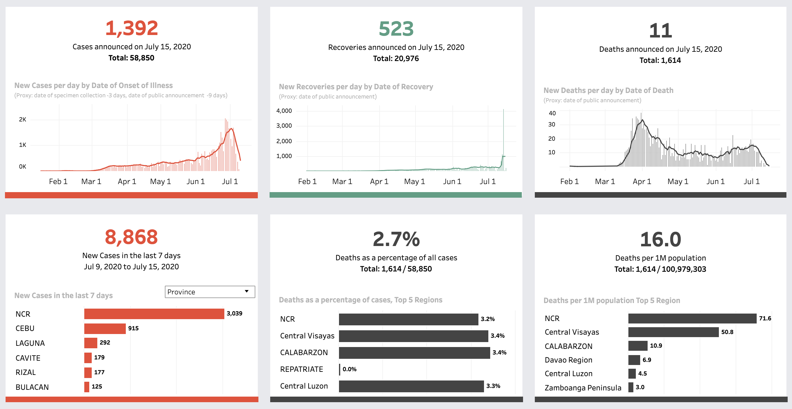
An overview of cases, deaths, and recoveries at the regional and national levels on Pintig Lab’s dashboard
To understand where the resources are deployed and whether they are distributed in the most needed spots, the allocation of the medical resources are also visualized on the maps and the plots below. The available beds for isolation, COVID-positive units, and PPEs are spread widely across the regions, while the supplies of ICU beds and ventilators are concentrated in urban settings. Interestingly, the available ventilators are almost twice as much as the available ICU beds, even though the utilization rate of the latter is higher.

Health capacity on Pintig’s dashboard
For the purpose of enhancing efficiency in resource utilization, we can anticipate future demands through the early signals emitted by the data. It will be also helpful to avoid the underutilization of resources. Through this map, we can use the bed occupancy rate to monitor the status and flag them to the municipalities and hospitals for supplementing or mobilizing resources several weeks before they reach critical levels.
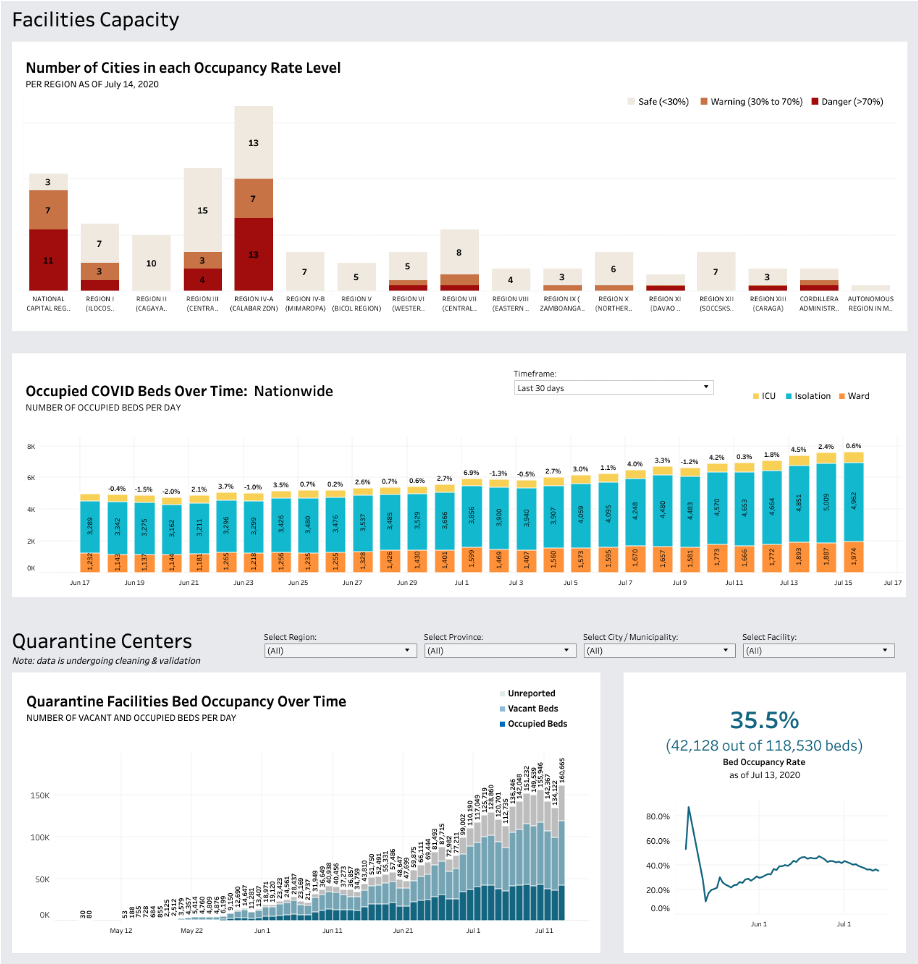
Hospital facilities capacity on Pintig Lab’s dashboard
Similarly, we can create another category to monitor the gaps in these resources when the occupied amount transcends the vacant ones. With this, we can quickly identify the hotspots and plan where the resources can be mobilized from the nearby hospitals or where patients can be transferred to.
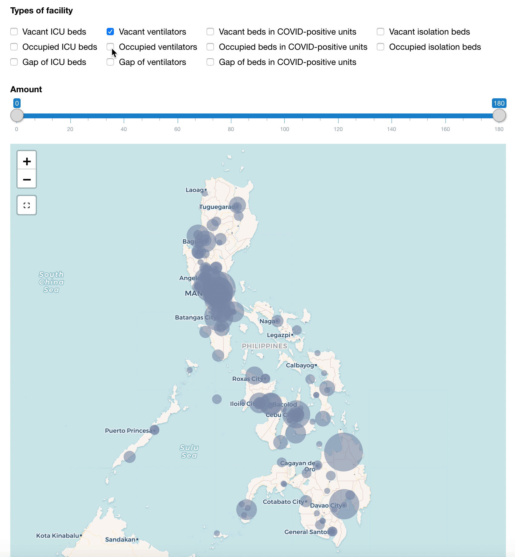
Map of hospital beds and ventilators (updated on 14 July 2020)
Optimization is also an issue for testing laboratories. While some laboratories are well-equipped and primed to receive testing samples, others are underequipped and with significant backlog, yet they continue to receive the majority of new testing samples each day. Together with DOH and the Inter-Agency Task Force on Emerging Infectuous Diseases (IATF), we have mapped out the Labs’ inventory stocks and estimated the remaining days until their depletion. If we combine this with the backlogs of the Labs, together with the projected viral infection rate, then we can better plan where and when the Labs will need new stocks, and how the testing samples should be distributed.
Given this, we would be interested in knowing further:
Is it possible to develop a resource planning model that can notify government and health providers of forthcoming shortages and optimize the deployment and utilization of the COVID-19 resources? If so, apart from the existing data, what other relevant data can we potentially leverage beyond the traditional sets used by supply chain management systems? And what should the model look like?
Inspired by the mask map in South Korea, can the information regarding the allocation of PPE be easily accessed by the citizens given the wide and dense network of health sites in the Philippines?
###
(to be continued)


