
 Locations
Who Benefits from Growth?: A look at the changing incidence of economic growth in Latin America and the Caribbean
November 22, 2019

Latin America and the Caribbean ranks as the second most unequal region in the world (after Sub-Saharan Africa). Despite the fact that income inequality has been on the decline in LAC in recent decades (indeed, in most countries in the region inequality was lower in circa 2018 than it was in circa 1990), people in LAC consistently report that the gap between rich and poor is widening. We observe this in perception surveys, but also in the mounting social conflicts and recent, very polarized, electoral processes that have taken place in the region. Most recently, this concern has been reflected in widespread protests across the region, such as those in Chile, Bolivia and Ecuador, in which citizens cite concerns over inequality as a key motivating factor.
What explains this dissonance between what inequality measures tell us and what people perceive in LAC? One reason for this apparent “mismatch” between observed patterns and perceived patterns may be due to the way that we are measuring inequality—and the limitations of these measures to capture the aspects of inequality that actually matter to citizens. For example, traditional measures of inequality (such as the Gini coefficient) are troublesome because they are not sensitive to changes in the shape of the distribution or to what happens in different parts of the distribution (particularly the tails).
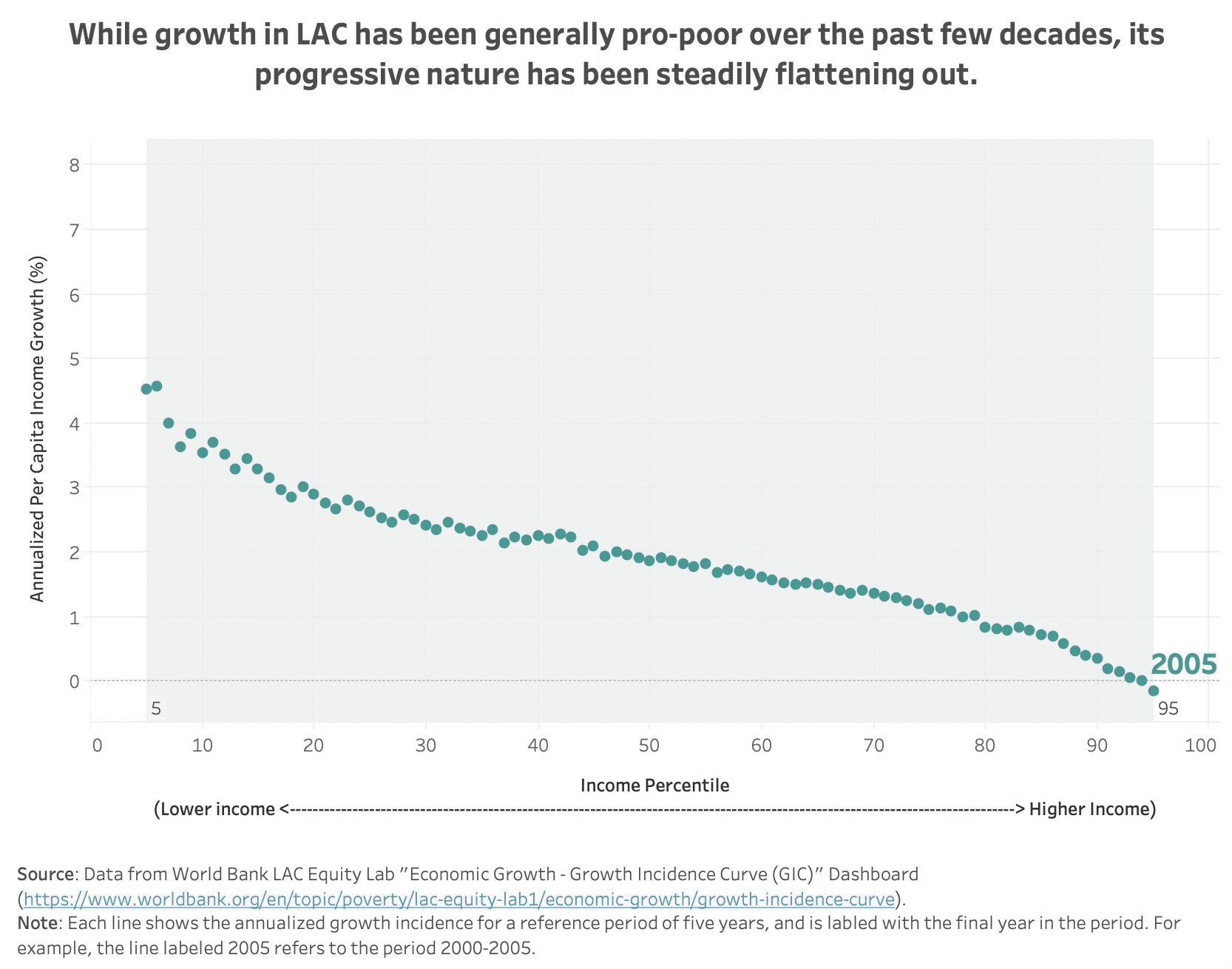
This #GraphForThought explores this “inequality puzzle” by looking at how people across the income distribution have differently benefitted from the gains of economic growth in recent decades. To do this, the graph uses data from the World Bank’s “LAC Equity Lab” dashboard on the incidence of economic growth in the region. Using their constructed aggregate of 17 countries in the region, this graph plots LAC’s “Growth Incidence Curve” for 13 consecutive 5-year periods (beginning with 2000-2005 and ending with 2012-2017). For each of these 5-year periods, the figure shows the average annualized growth of each income percentile (ranging from the poorest income percentile on left to the richest income percentile on the right). Thus, if the graph is downward sloping (higher on the left than on the right), we can interpret that growth in the period was pro-poor (meaning that the income of the poor was growing at a faster rate than that of the rich). If the graph is upward sloping (higher on the right than on the left), we can interpret the opposite. Note that the year labeled in the figure refers to the final year in the period (for example, the label 2005 refers to the period 2000-2005).
Watching the graph cycle over time, we see that while growth in LAC has been generally pro-poor over the past few decades, its progressive nature has been steadily flattening out. This shift might be partially explained by the commodity boom that characterized the region’s economies at the beginning of this period, which shifted relative prices in favour of non-tradable sectors intensive in low skill labour, and which came to an end around 2013. This movement of the growth incidence curve implies that economy's growth pattern has been such that the poor are no longer the group that is most benefitting. This supports the notion that the story of declining inequality in the region may not be so simple as it first appears. Indeed, a dynamic look across the whole distribution complicates the story.
Moreover, it is important to note that this graph is missing two very important pieces of information: what is happening at the tails of the distribution (the poorest 5% and the richest 5%) and what is happening in the other countries in LAC (only 17 countries are included here). This information is unfortunately missing due to data constraints. Indeed it is very difficult to accurately capture what is happening at the very bottom and at the very top of the income distribution, and to know what is happening at any point in the distribution in countries with limited household survey data. However, new measures have emerged that try to capture the income at the top, and report much higher inequality levels. For example, if we look at a similar graph produced by the New York Times on the changing growth incidence in United States (the graph which inspired this one), we see that most of the action happens at the very top of the income distribution (in the Top 1%). Recent studies suggest that a similar pattern is likely to be true in LAC as well. For example, as a recent study on Brazil found, between 2001-2015 the income share of the Top 1% increased from 26.2%. to 28.3% (and the income share of the 10% increased from 54.3% to 55.6%). Indeed, concentration of income at the top, when it is possible to measure it, seems to have increased.
While it can be argued that increasing inequality is not bad per se (for example, in some cases it can serve as an incentive to advance or can be productivity-enhancing), it is typically associated with patterns of economic, social, and political exclusion, and leads to significant costs for society. These costs manifest in different ways, ranging from power asymmetries, to policy distortions, weak social cohesion, and persistent underinvestment. Thus, if countries in LAC are to make progress in consolidating themselves as strong cohesive middle-class societies, they will need to continue tackling the challenge of inequality. They will need to go beyond averages, beyond income and beyond today, as our forthcoming Human Development Report 2019 on inequalities in human development argues. Stay tuned for the launch of this important publication on 9 December 2019.