Kumu: A Powerful Tool for Mapping and Visualizing Complex Data
September 3, 2023
By: Ru'a Al-Abweh, Head of Solutions Mapping, UNDP Jordan Accelerator Lab
Suppose you are a data geek or spend a lot of time organizing, coding, and analyzing data on spreadsheets. Then you would be familiar with the overwhelming feeling of a massive dataset in one table. You may have also wondered if there are other ways to make sense of your data that would complement the overflowing spreadsheets. I was lucky to learn and try one tool that does just that - Kumu.

Kumu is an online tool for mapping and visualizing systems, stakeholders, networks, and more, with a backend spreadsheet (uploaded, linked as a Google Sheet, or entered directly into Kumu) that hosts all the data that Kumu automatically visualizes. Different automated visual layouts can be tweaked by modifying colours, shapes, fonts, and sizes. Furthermore, the maps can be shared as interactive, non-editable maps through a hyperlink (which can also be used to embed the map on a website); or exported as pdf, png, xlsx (Microsoft Excel sheet), and json (JavaScript Object Notation) files. With a paid Pro account, the project can be made private, and the owner can add people with different types of access, including the ability to edit. More here on permissions.
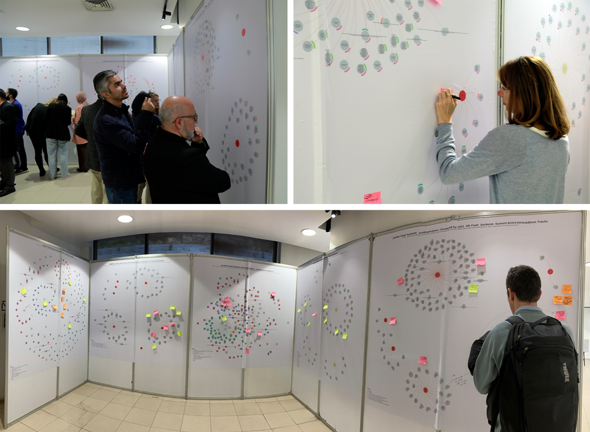
As part of the Accelerator Lab's role in UNDP Jordan's efforts on food systems and portfolio design, we used Kumu to map stakeholders and existing efforts -both within UNDP Jordan and beyond (read about our work on food and portfolios here and here). This was achieved by first populating a spreadsheet with all the available data, reorganizing it into another spreadsheet format that can be read by Kumu, and then importing it into Kumu and making some tweaks to the visuals. We produced several maps, which were printed and used at a workshop to get feedback on the data and collectively make sense of the information (links to all maps are at the end of this blog). People could leave notes on the maps, ask questions about the data, and discuss ideas with each other. These maps were also part of a timeline created by the Accelerator Lab to summarize the country office's journey on food systems and portfolio. After the country office realized the power of Kumu to visualize, organize data, and make sense of connections between different pieces of information, the Accelerator Lab was asked do more mapping — this time, to map all of the work of the country office and code it with themes from the Country Programme Document (2023-2027). The purpose of this exercise is to facilitate discussion and decision making on a transition from projects anchored in technical programmes to an overarching portfolio that focuses efforts towards one path.

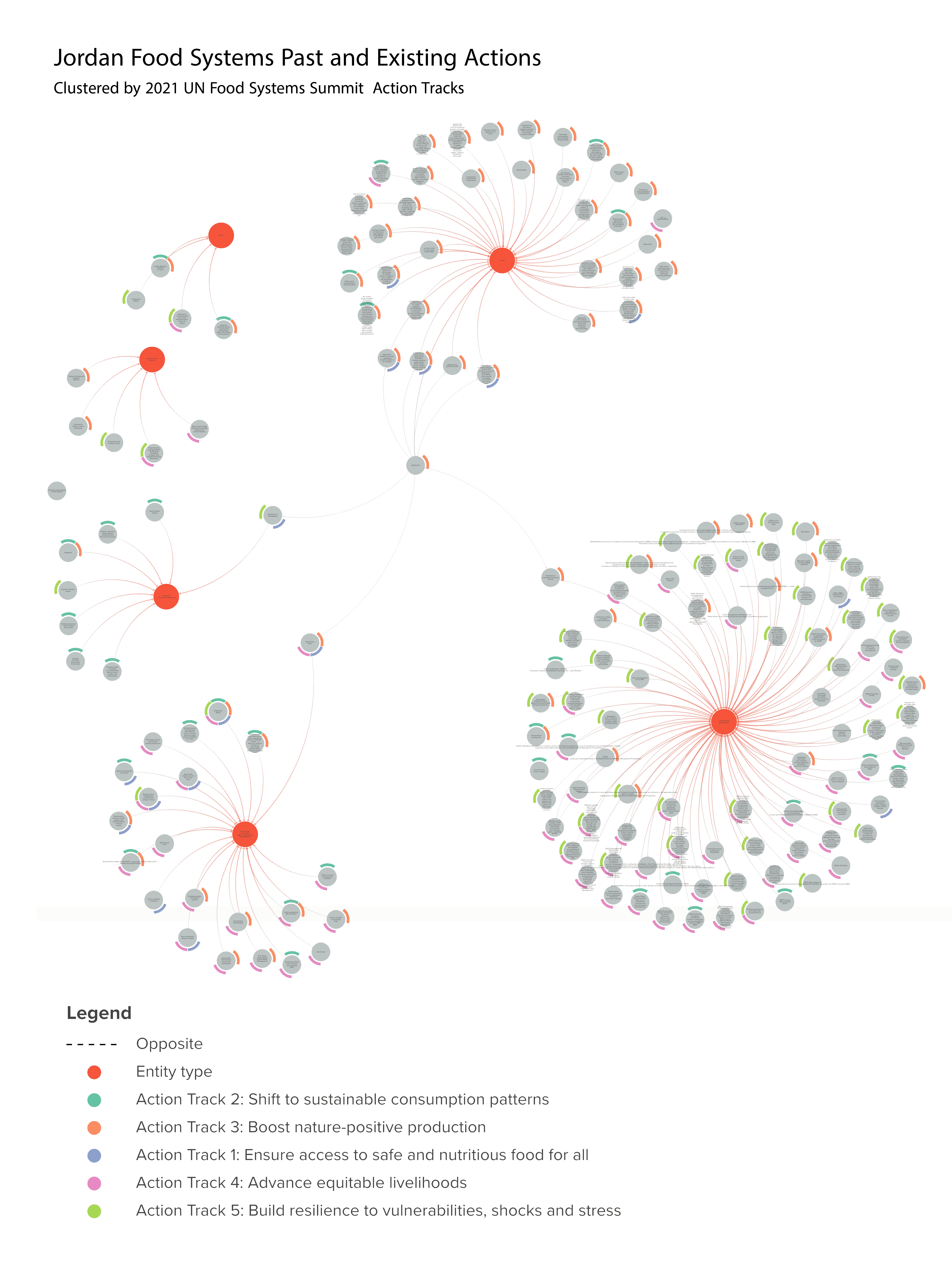
Caption: one of the maps related to UNDP Jordan’s work on food systems, which was produced through Kumu.

Caption: colleagues review and discuss the Kumu maps and leave notes on sticky notes and the poster.
Based on the experience of testing and using the free version of Kumu, we learned about the tool's advantages, limitations, and workarounds. Here are the most important points:
| Advantages | Limitations |
| Making maps on Kumu is relatively easy if you enter the data correctly into the spreadsheet. Learning how to use it also doesn't have a steep learning curve, at least speaking as someone who has experience with other design, visualization, and mapping programs (AutoCAD, ArcGIS, SketchUp, Revit, Adobe Suite, Canva, Mural, Miro). | Much of the learning is hands-on, so in addition to reading and watching online resources, you just have to start working and learn as you go. Sometimes glitches occur in Kumu's ability to read the spreadsheet data. For example, we learned by trial and error (and some hair-pulling) that leaving empty rows in the spreadsheet causes errors in the mapping outcome. Workaround: diligently follow the guidance and any templates on the Kumu website, be patient, and keep trying when something isn't working! You can also reach out to Kumu support channels. We emailed them for help and received an answer and resources. |
| The automated visuals allow people not experienced in design to create organized maps with lots of data. This saves time and effort, even for the experienced designer, as trying to visualize a lot of data manually can be tricky (Here's a mapping of UNDP Jordan work manually created by the Accelerator Lab on Mural in 2022 that could have done much faster had we known about Kumu). | If you are creating a map with a big dataset, the resulting visual on Kumu can be overwhelming and challenging to make sense of. Workaround: customizing the map with edits to the colours, shapes, sizes, and fonts can make a complex map more user-friendly. |
While the individual elements of the visual can be manually moved around and rearranged if you want to tweak the automated layout, they immediately bounce back if you refresh, leave the page, or make and save changes to the settings. These changes are also not maintained if you share the hyperlink with someone for viewing. Workaround: export the map with the tweaked layout before leaving the page, changing settings, or refreshing. | |
| The option to link or import data to Kumu through a live Google spreadsheet eases updating and co-creating the mapping. When any data is updated in the spreadsheet, the Kumu map automatically updates. | We needed to simultaneously maintain and regularly update two spreadsheets –one for colleagues to edit and directly input data and a second formatted in a way Kumu could read, which was managed by one member of the Accelerator Lab. Workaround: this is manageable but requires attention to detail and regular updates of both sheets to avoid mismatched datasets. |
| Although there are several mapping templates on Kumu, we were able to meet our needs using just one. | In addition to concept, stakeholder, system, and network maps, Kumu also has a geographic mapping feature. Although our experience with this feature is limited, based on our humble testing and research, Kumu doesn't seem to be the best tool for geographic mapping compared to other available programs (such as Power BI and ArcGIS). One limitation is that one data entry can only have one geographic location, which is a problem for mapping UNDP Jordan projects, as some projects operate in several places. Workaround: create three separate data entries, each with a different location. |
Learning a new tool always opens up new possibilities and ways of seeing and understanding issues. The experience of UNDP Jordan in using Kumu as an online mapping and visualization tool for our work on portfolio design and food systems shows that there is high potential for development agencies to use Kumu for stronger understanding, data analysis, and strategizing —ultimately, paving the way for more innovative and impactful work. On a personal level, I am glad I had the opportunity to learn Kumu, and I hope to find other valuable ways to use it in the future.
Resources:
- Getting started - Kumu
- Kumu YouTube channel with various tutorials
- Kumu maps produced for UNDP Jordan's work on food systems and portfolio design:
- Jordan Food Systems Past and Existing Actions -Clustered by 2021 UN Food Systems Summit Action Tracks
- Jordan Food Systems Past and Existing Actions -Clustered by Sectors
- Jordan Food Systems Past and Existing Actions -clustered by location
- UNDP Jordan's Past and Existing Actions Related to Food Systems
- Stakeholders of the Jordan Food Systems
- For inspiration, here are three examples of interactive maps and platforms created on Kumu:
- Blog: A toolkit for mapping relationships among the Sustainable Development Goals (SDGs)
- Permaculture in Ontario: mapping of permaculture practitioners in Ontario
- Bham BizHub: mapping of service areas of organizations serving startups and small businesses in Birmingham, Alabama.

 Locations